Nickelodeon Redesign
Role:
Design, 3D, Technical Direction, Animation
Agency:
Trollback & Company


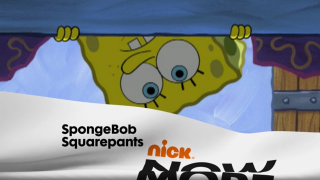
Nick’s biggest hit at the time of this rebrand was “iCarly” — a show about three kids with a hit internet reality program. They’re not superheroes. They’re “regular kids” who play with the line between reality and “reality”.
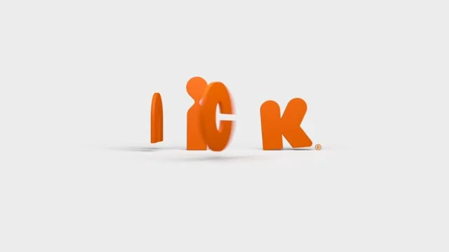
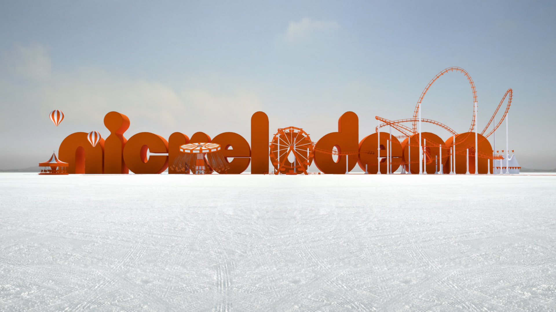
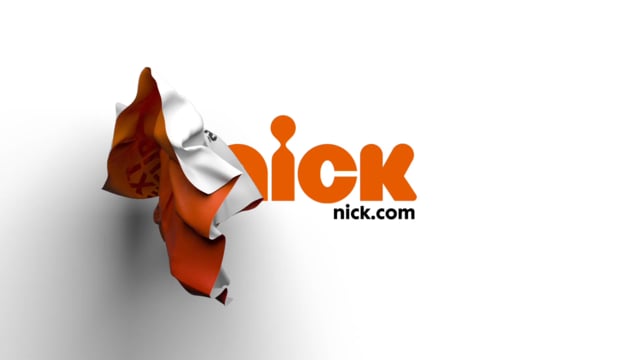
So the central idea for the branding is to be irreverent and play with breaking the theatrical concept of “the fourth wall” — the division between the stage and the audience. We use the screen itself as an element to play with: It can crumple up like paper, pop out like pegs, or peel off the screen like vinyl cutouts. We wanted the type and the characters to interact with the viewer and draw attention to the fact that this is a brand. All of which is a wink at the fact that this is all staged for you...
It’s also worth nothing that this identity is radically different from other children's networks. It uses only black, white, and orange, a lot of white space, and it’s very clean.
A key criteria for designing and evaluating elements for this network was that it had to have some basis in reality. There is drag, gravity, friction. The materials don’t defy physics. This identity can only happen in motion. The logo always ends up in the same place, but how it gets there is where the story is.