BBC Earth | Identity
Role:
Concept, Creative Direction, Design, Technical Direction, Animation
Agency:
Trollbäck + Company
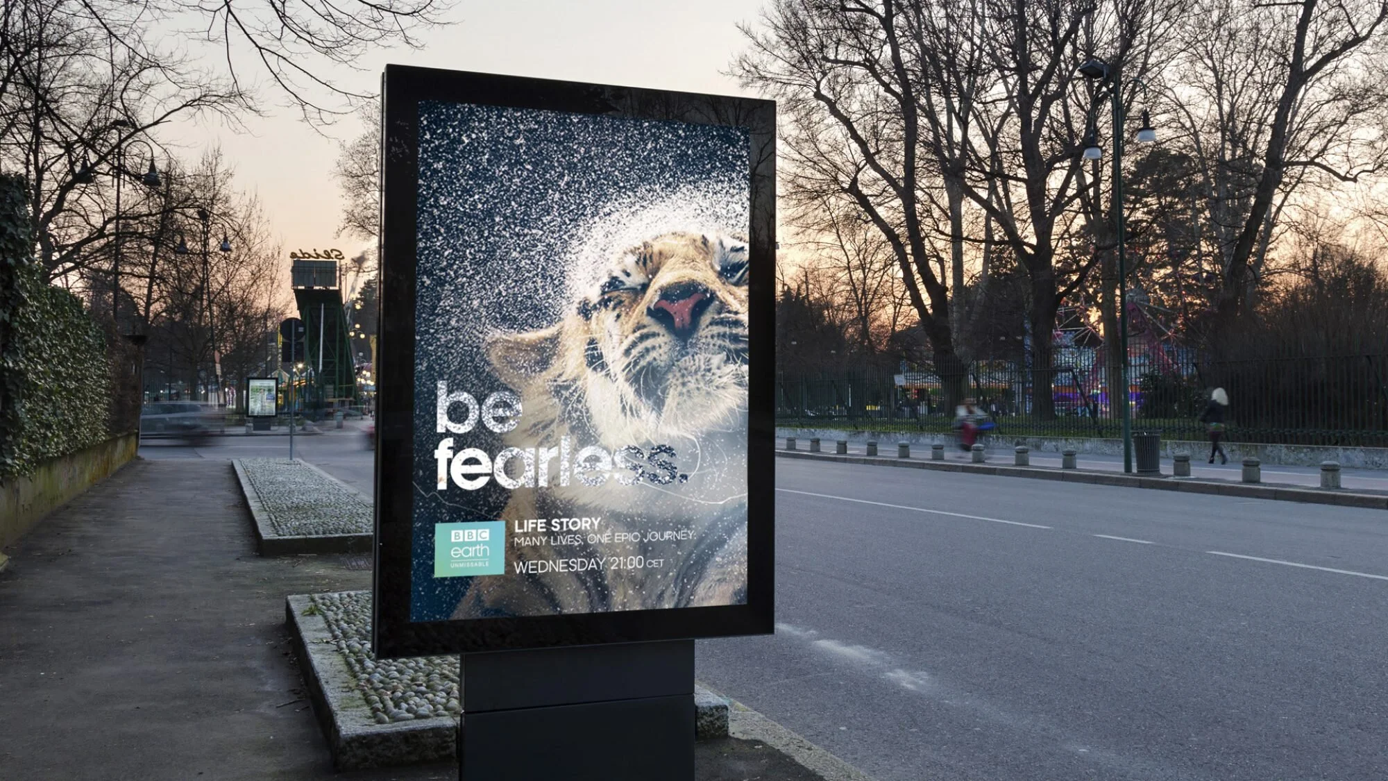
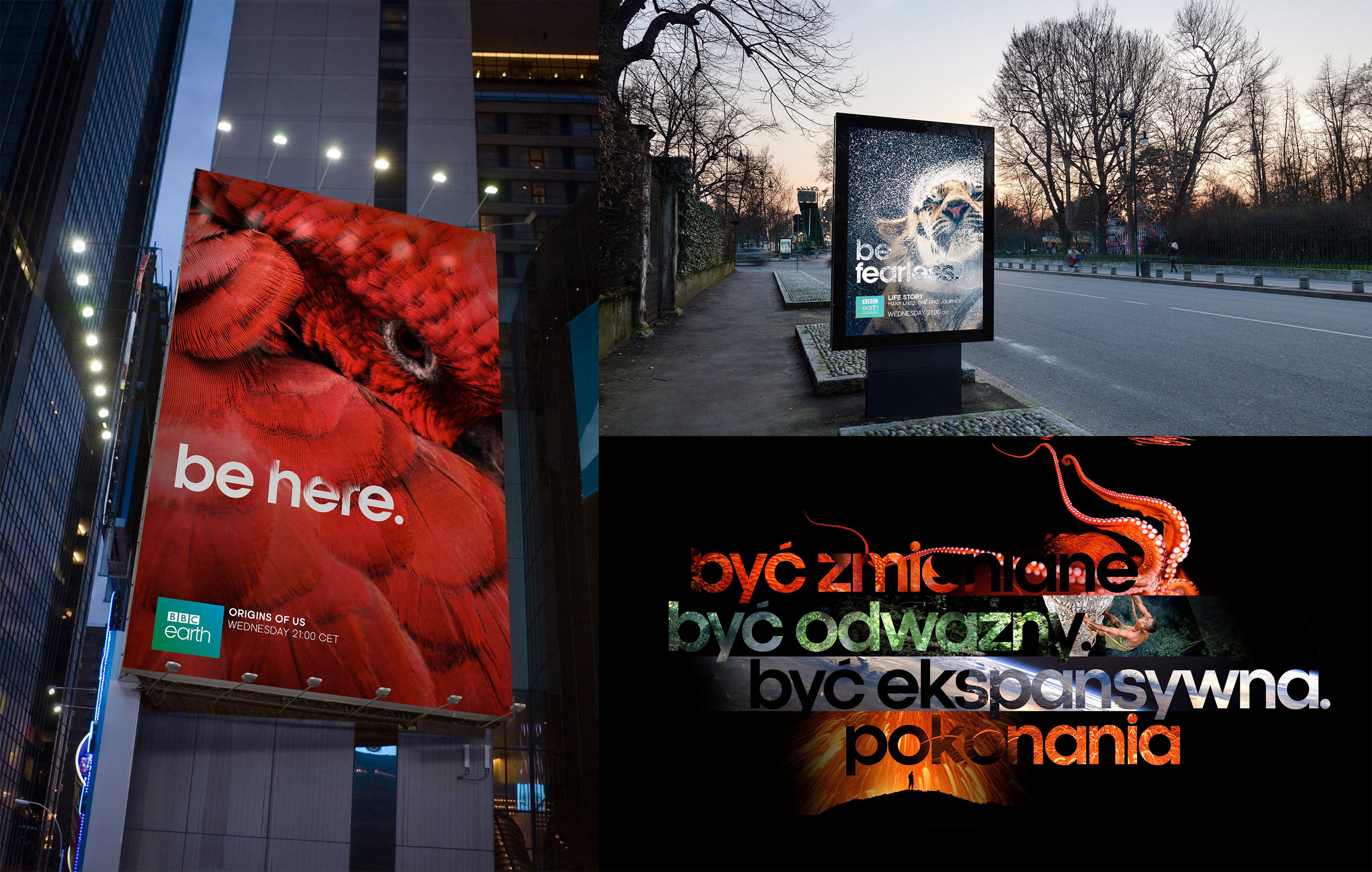
In 2013-14, T+Co worked on a major branding package for the BBC. This included branding a suite of new channels: BBC Brit, BBC First, BBC Earth, and the BBC worldwide. While I worked on all four packages, my focus was on BBC Earth. The central idea of the channel is to take you to places no one else can reach. We developed the tagline “Be Here” to convey this immersive and stunning content.
I decided early in the process that we would leverage the BBC’s unparalleled portfolio of nature documentary footage.This was one of the first networks where the content of the network became the hero of the branding package and defines the look of the network, rather than the logo or brandspace being the hero.
We developed three key methods that could be used across media to frame content and provide transitions between elements. Each of the approaches (portal, window, or type in footage) embodied the idea “Be Here”.
This global branding project was described in exhaustive detail in the styleguide for BBC Earth, which is over 300 pages. Everything in this system is derived from nature: The grid system comes from the golden section (if there’s anywhere this is appropriate, this is it!). Type sizes are derived from the Fibonacci sequence, and the typeface, Kamerick 105 is based in geometry. There is no set color palette, and instead, color relationships are drawn from the footage.


